
The name tattoo on the forearm involves several technical decisions that directly influence readability and longevity. Character size, text orientation, typographic style, and the addition of graphic elements: each parameter alters the final result. Understanding these variables allows for a choice that suits the morphology of the arm and the message conveyed by the tattoo.
Orientation and readability of the name on the forearm
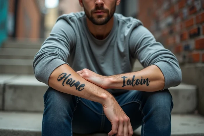
A rarely discussed point in image galleries: the reading direction of the tattoo. On the forearm, the text can be oriented to be read by the wearer (reverse for an outside observer) or to be read by others (standard direction). This choice alters the perception of the tattoo on a daily basis.
Related reading : Creative News and Digital Trends: Discover Everything About the Pixikult Universe
The inward orientation is suitable for names worn as an intimate reminder, often those of children or deceased loved ones. The outward orientation aligns better with designs conceived as bold aesthetic elements. Neither option is more “correct,” but the reading direction should be decided before the stencil, not during the session.
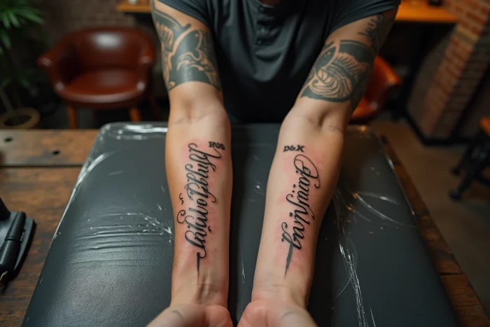
The natural curvature of the forearm also creates an optical distortion. A long name (seven letters or more) placed on the inner side experiences a slight visual twisting effect. An experienced tattoo artist compensates for this effect by adjusting the spacing between the letters at the ends. Several artists document this technique among the artistic inspirations of Beauté Nature, with examples of long names adapted to the morphology of the arm.
Recommended read : The latest trends and analyses to follow in the business world
Typographic styles for a name tattoo: comparison by criteria
The lettering style determines both the aesthetic and the durability of the tattoo. Here is a comparison of the most requested typographic families for names on the forearm.
| Style | Readability from a distance | Longevity | Adaptability to short/long names |
|---|---|---|---|
| Classic cursive (script) | Medium | Good if thick strokes | Better for short names |
| Gothic lettering (blackletter) | Low | Very good (dense strokes) | Short names only |
| Linear typography (sans-serif) | High | Very good | Suitable for all lengths |
| Ornate calligraphy | Low to medium | Variable (fragile thin lines) | Short or medium names |
| Custom handwritten style | Variable | Depends on stroke thickness | All lengths |
Cursive lettering dominates requests for family tattoos. In contrast, the fine lines of ornate calligraphy fade faster, especially on the outer side of the forearm, which is more exposed to friction and sunlight.
Sans-serif typography is gaining popularity among men looking for a clean design. This minimalist style ages well as the uniform strokes maintain their contrast with the skin over the years.
Graphic elements associated with the name: family symbols and patterns
A name alone on the forearm produces a sober result. The addition of graphic elements transforms the tattoo into a narrative composition. The most visually coherent associations adhere to a few principles.
- The tree of life or family tree naturally frames one or more names, with each branch potentially bearing a different name. This pattern works particularly well on the entire forearm due to its vertical format.
- Symbols of family connection (infinity, stylized heart, handprint) add meaning without overwhelming. They are placed at the beginning or end of the name, never above (which creates visual imbalance).
- Floral elements (roses, laurel branches) create an organic frame around the text. This aesthetic choice suits compositions that integrate multiple names into a single design.
- Birth dates in Roman numerals, placed beneath the name in smaller type, add information without altering the main typographic balance.
A common pitfall is accumulating too many elements around the name. Beyond two associated motifs, the text loses readability. The visual hierarchy must remain clear: the name is the main element, and the rest accompanies it.
Specific placement on the forearm: inner, outer, or lateral side
The forearm offers three distinct areas, each with its technical constraints.
Inner side
The least exposed area to the sun, thus where the ink retains its density best. The skin here is thinner and more sensitive during the session. It is the preferred location for names with intimate value, as the inner side is primarily visible to the wearer.
Outer side
More surface area available for long names or compositions with symbols. Sun exposure accelerates ink degradation, making the choice of thick strokes particularly relevant in this area. Linear and gothic styles hold up better here than fine calligraphies.
Lateral side
Rarely utilized, this area allows for original vertical designs. A name written from top to bottom along the ulna creates a graphic effect different from classic placements. The constraint: the space is narrow, limiting the choice to short names or initials.
The choice of area also influences the possibility of future expansion. A name placed in the center of the inner side leaves little room to add other elements. Planning the evolution of the tattoo from the first session avoids compromises when adding later.
The name tattoo on the forearm remains one of the most requested designs, across all styles. The difference between a result that ages well and one that fades lies less in the chosen pattern than in the technical parameters: stroke thickness, placement on the arm, letter spacing. Discussing these specific points with the tattoo artist before finalizing the stencil remains the best guarantee of a lasting result.